These shots are color graded to what you might call a more modern and moderate color toning.
The grading used here focused on the green in the landscapes. This, as it was the dominating color at the time when the pictures were taken.
As you can see, they are quite different from many landscape pictures. The reason why is that many landscape pictures are colorgraded using standard Adobe landscape color grading leaving you with quite contrasty and highly saturated colors. And that can be all fine, but it is used so much that the pictures you see tend to look quite the same. Bordering on or directly creating a postcard look.
The landscape pictures below were taken on an island close to the artic circle in May before spring colors really started to “pop” - leaving green as the dominant color. I could have emphasized the small amount of yellow mid color tones that were in the landscapes. This would be pleasing to the eye.
But that would merely have you made the wrong conclusion - creating a disappointment because of lack of multiple colors if you were to go there yourself.
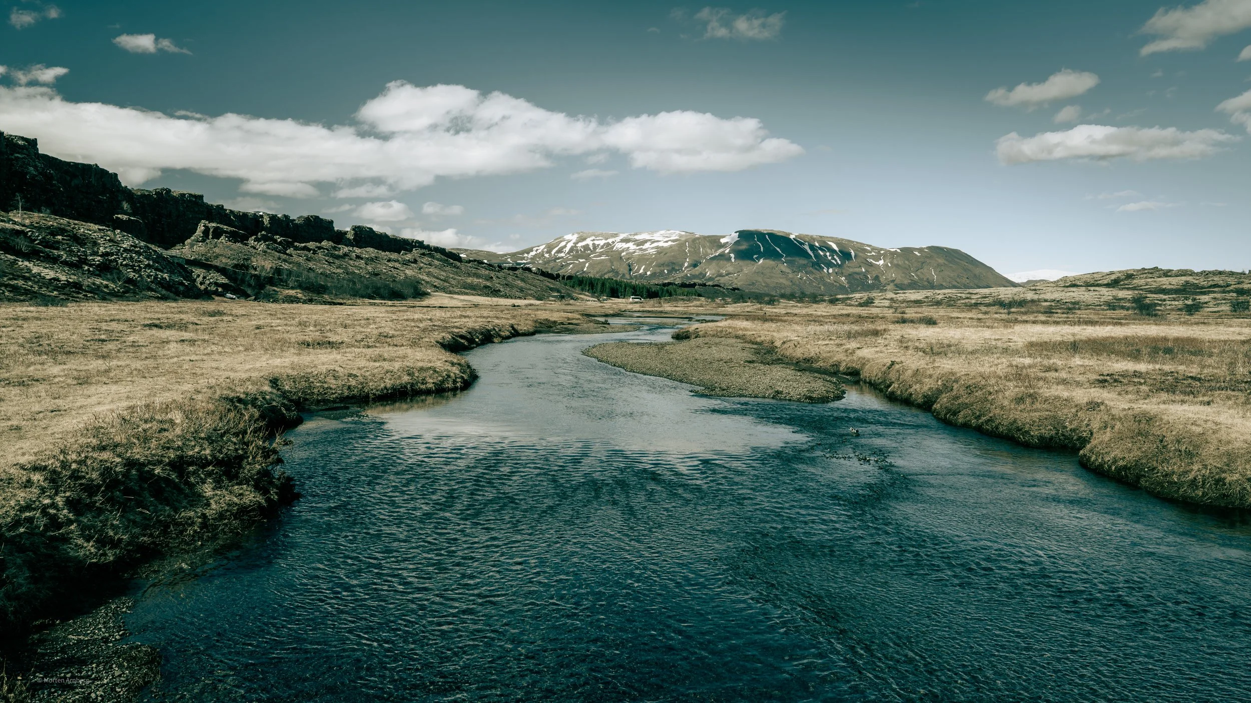
Full frame camera and 24 mm lens - ISO 160, F/13 at 1/200 shutter speed (strong winds). Hand held. Polarizer filter used.
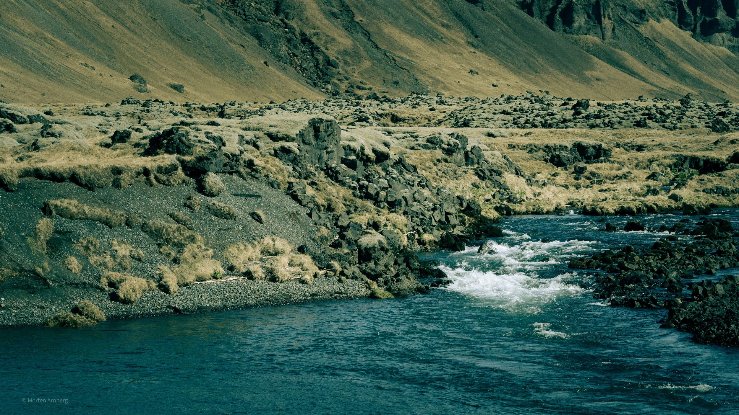
Full frame camera 100mm lens (100-400 mm zoom) ISO 200, F/13 at 1/640 shutter speed (very strong winds). Hand held. Polarizer filter used.
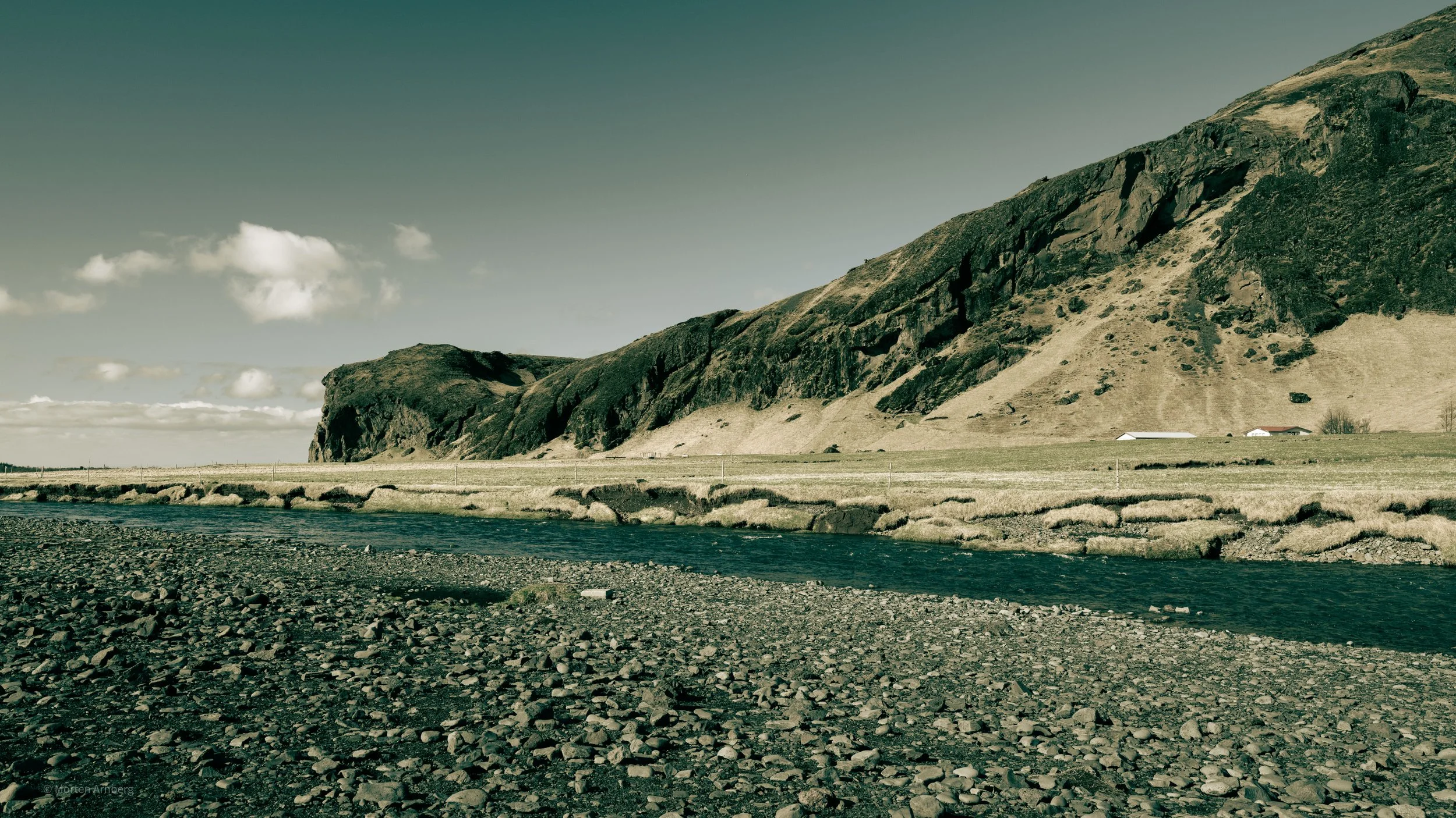
Medium format camera 35 mm lens - ISO 320, F/11 at 1/200 shutter speed (moderate winds). Hand held. Polarizer filter used.
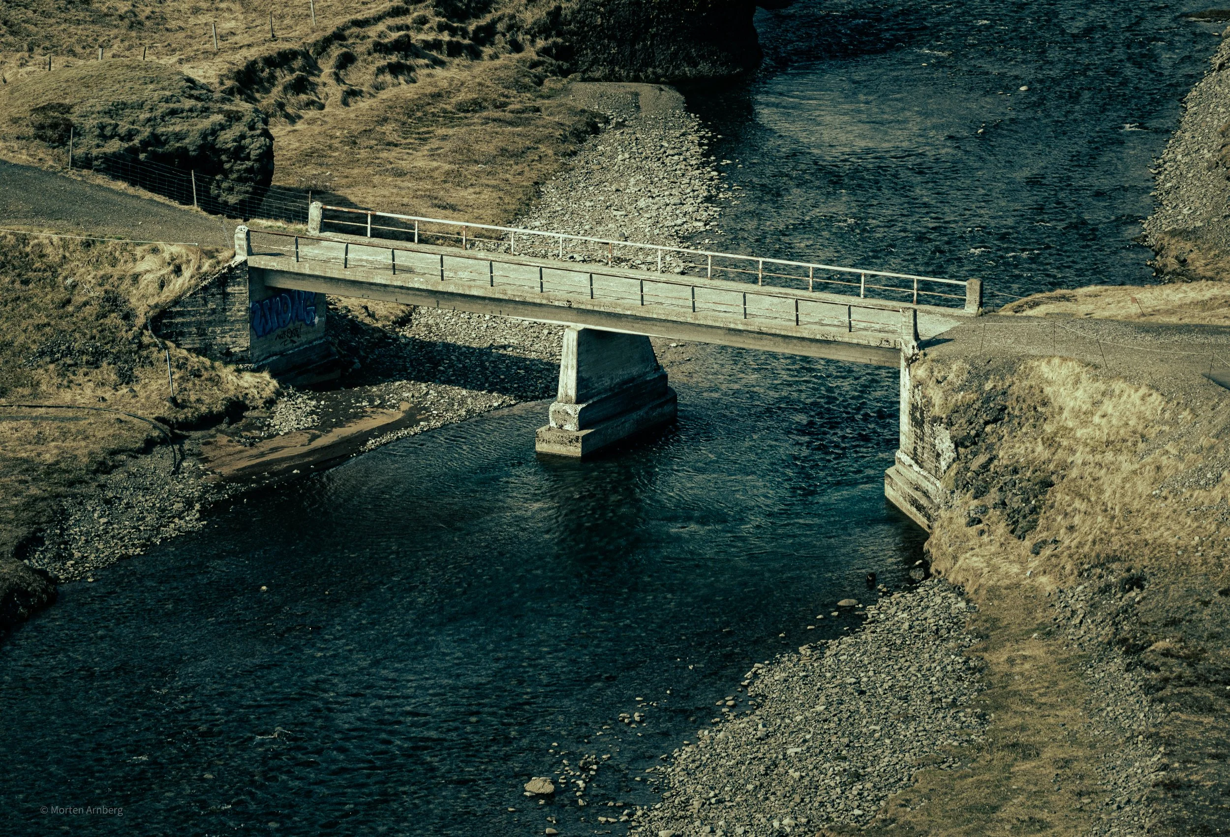
Drone shot - 168 mm lens, f/2.8 and 1/400 shutter speed (very strong winds).